Dricdricc.github.io
Preferences, Pain Points and Priorities
Prelude
The Data Visualization Society released a census to understand the current landscape of data visualization.
Participants are asked a variety of questions about their practice and background.
Given the recent boom of interest in data science, I thought it would be great to see how different “generations” of practitioners differ in aspects covered in the survey. We can qualify these “generations” through respondents’ years in professional experience.
Out of the 1,766 respondents, 1,684 filled out the “years in professional experience” field. Plenty to work with.
Below is the distribution of respondents’ years in professional experience.
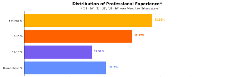
While we see that the base of respondents skew to the younger side, the census also has decent representation from older folk.
In these following sections, we unpack how each cohort is different from (or similar to) other cohorts.
Preferences
“What technologies do you use to visualize data?”
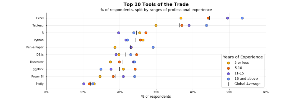
For the plot above, you read one dot as “Of the people that belong in group x, _% of them use tool Y to visualize data.”
The black tick indicates the global average - “Of everyone that has answered the census, _% of them use tool Y to visualize data.”
Subsequent graphs in the following sections follow a similar theme.
Some insights on the preferred tools per cohort,
- Excel, Pen & Paper, Power BI and Illustrator are more widely adopted by tenured folk than younger folk.
- Popular languages and libraries - R, Python and ggplot2 - are more used by newly minted practitioners.
Pain Points
“What are your biggest frustrations with doing data visualization in your job?”
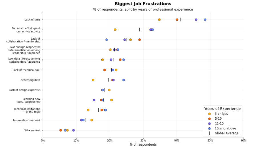
Very recent practitioners (5 or less years into their career) are frustrated by their lack of technical expertise
Against the global average, younger folks tended to answer “lack of design expertise”, “lack of technical skills”, “learning new tools / approaches”.
They show an aggressive focus on their technical capabilities.
They also mentioned a lack of collaboration and mentorship opportunities.
Lack of time, too much effort spent on other things most felt by more tenured folk
More tenured folk answered “Lack of time” and “Too much effort spent on non-viz activity” significantly more than the global average.
“What are the three most important issues facing data visualization?”
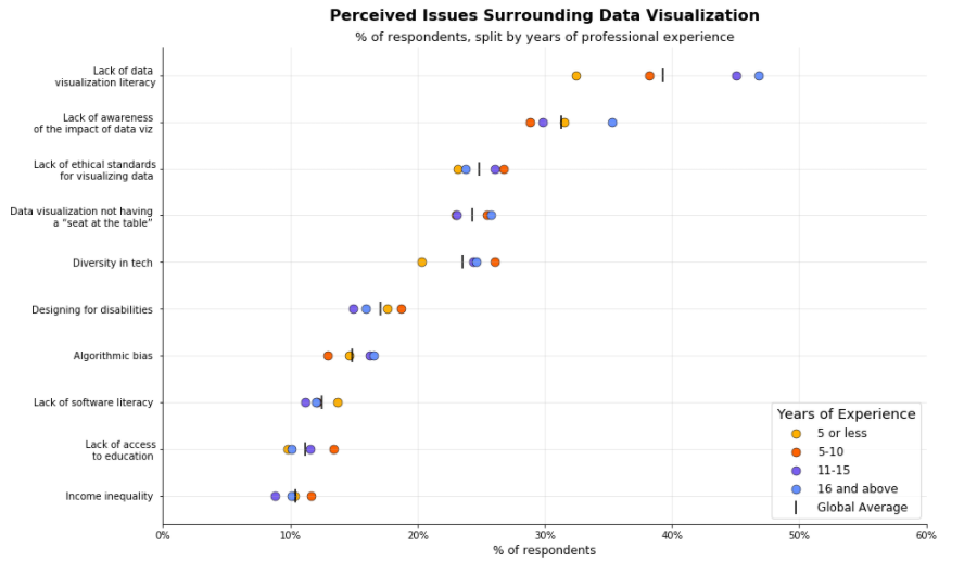
Data visualization literacy, together with its perceived impact by the general public, is low”
More tenured folk champion these two statements, together with “data visualization not having a seat at the table.”
Younger respondents are more focused on software literacy
This is in theme with their frustrations - both are very focused on the tools of the trade.
While the lack of data visualization literacy is also a main issue for them, it’s not as prevalent.
Priorities
“What area is your next priority for improving your data visualization skills?”
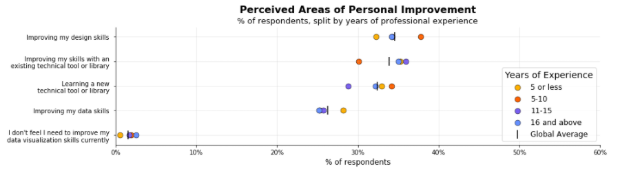
Exploring new tools in the first 5 - 10 years, drilling down on them after
In their first 5 - 10 years, respondents focus on their data skills and learning new tools.
Past that, respondents focus on improving their existing skillset.
“Which of the following would you be likely to use professional development funds on?”
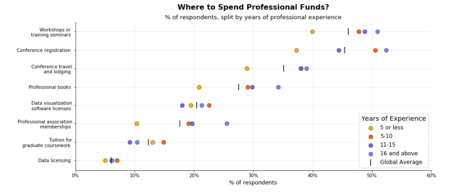
More tenured practitioners would use their funds for networking, unstructured learning
- We see this in how they answer the questions pertaining to attending conferences and joining associations.
- They also prefer “professional books” and “workshops / training seminars.”
Younger practitioners look for structured graduate coursework
Postmortem
In this analysis, I describe how different generations of practitioners differ in their tools used, beliefs and priorities.
I hope that this gives some perspective on how practitioners in different professional capacities experience the field of data visualization.
Professionally, younger practitioners are focused on learning technical skills, like R and Python, to generate their visualizations.
At the same time, they say that the “lack of collaboration and mentorship” is one of the bigger frustrations of the job.
Perhaps there are opportunities in your organizations to have more structured mentorship programs, if there aren’t any already in place.
And you don’t have to extend these learning sessions to only data folk - teaching data literacy inside organizations could go a long way.
According to respondents, data literacy and the perceived impact of data visualization is still lacking.
Beyond the scope of this study, others have also shown that larger systemic issues like income inequality and diversity in tech are also prevalent in this field.
Needless to say, it also falls on us to help our professional community, and our local communities at large, thrive.
Cheers!
Contact Me
If you’d like to reach out, feel free to do so via LinkedIn.
Thank you to the Data Visualization Society for the opportunity to work on this challenge!